Comments on the new forums

Comments on the new forums
Make them in this thread, please. 
Re: Comments on the new forums
Very good job bringing forum up to date in one stroke with all that content involved
The new features are great too gotta love the new phpbb.
The new features are great too gotta love the new phpbb.
Forums theme
Chris,
Hopefully you don't get too wrinkled by this post, I don't want you thinking I don't love the new forums, they rock. I love having darker backgrounds with light text. My eyes <3 you.
But some things could use tweaking
1) The fixed width uses maybe 60% of my screen. That makes for a heck of a lot more scrolling up/down. I know, 1920x1200 isn't quite normal but ... still ... fixed width == wasted space. Especially with the slightly larger fonts (which I like, keep em).
Additionally since I use even larger fonts on my system the fixed width is breaking a bit. "Last visit was: Tue Aug 26, 2008 6:33 am It is currently Tue Aug 26, 2008 8:10 pm" both fall outside the grey area on my screen as do many of the buttons on the action bar.
I'm sure all of that is because I have my screen fonts enlarged slightly because of the size of my monitor, since if I use control+mousewheel to shrink the browser window by 1 size it all fits magically.
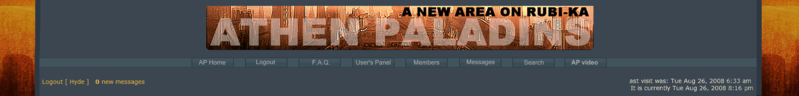
2) The image up top is very tall ... looks great ... but I think people like you and I who spend hours on the forum each week will eventually get over the looks and crave a little more space.
If you made the logo my suggestion would be to slide the text layer to the middle of the image and chop 20% off the top and bottom ... you'd keep the main composition but save alot of space.
I haven't done anything with regards to theming phpBB so it might take me awhile to modify things, but if you haven't either and the amount of time is equal for either of us, I can look into it.
3) Is there a way to load an alternative theme? I can't find it on my user control panel. If there was we could keep this all as the default theme and hack it a bit under a new theme to fix it for weirdos like me.
...
Anyway ...
The way I see the forums now
Mockup of possible improvements
The logo image in the mockup isn't perfect, I just chopped the current one, whoever has the source files (I'm assuming you) can make it look alot better. Might even give it a gradient on each edge that could transition to a background color like:
this
(without looking so crappy, its late and just a mockup)
PS. The fixed width is also messing with me on this editing window ... the links used above cause the scrollbars to wig out a bit and I can't see 1/2 of what I type between the URL tags.
Hopefully you don't get too wrinkled by this post, I don't want you thinking I don't love the new forums, they rock. I love having darker backgrounds with light text. My eyes <3 you.
But some things could use tweaking
1) The fixed width uses maybe 60% of my screen. That makes for a heck of a lot more scrolling up/down. I know, 1920x1200 isn't quite normal but ... still ... fixed width == wasted space. Especially with the slightly larger fonts (which I like, keep em).
Additionally since I use even larger fonts on my system the fixed width is breaking a bit. "Last visit was: Tue Aug 26, 2008 6:33 am It is currently Tue Aug 26, 2008 8:10 pm" both fall outside the grey area on my screen as do many of the buttons on the action bar.
I'm sure all of that is because I have my screen fonts enlarged slightly because of the size of my monitor, since if I use control+mousewheel to shrink the browser window by 1 size it all fits magically.
2) The image up top is very tall ... looks great ... but I think people like you and I who spend hours on the forum each week will eventually get over the looks and crave a little more space.
If you made the logo my suggestion would be to slide the text layer to the middle of the image and chop 20% off the top and bottom ... you'd keep the main composition but save alot of space.
I haven't done anything with regards to theming phpBB so it might take me awhile to modify things, but if you haven't either and the amount of time is equal for either of us, I can look into it.
3) Is there a way to load an alternative theme? I can't find it on my user control panel. If there was we could keep this all as the default theme and hack it a bit under a new theme to fix it for weirdos like me.
...
Anyway ...
The way I see the forums now
Mockup of possible improvements
The logo image in the mockup isn't perfect, I just chopped the current one, whoever has the source files (I'm assuming you) can make it look alot better. Might even give it a gradient on each edge that could transition to a background color like:
this
(without looking so crappy, its late and just a mockup)
PS. The fixed width is also messing with me on this editing window ... the links used above cause the scrollbars to wig out a bit and I can't see 1/2 of what I type between the URL tags.
Re: Forums theme
Another issue is that when you mouse-over a link the CSS changes the displayed text from normal weight to bold. That looks great if the text is alone but if it is in the middle of normal text it gets a bit ... strange.
test test test test test test test test test test test test test test test test test test test test test test test test test test test test test test test test test test test test test test test test test test test test test test test test test test test test test test test test test test test test test test test test test test test test test test test test test test test test test test test test test test test test test test test test test test test test test test test test test test test test mouseover me to see what I mean, tell me if you don't see it and I'll screenshot it, keep an eye on the end of the paragraph where the words completely shift test test test test test test test test test test test test test test test test test test test test test test test test test test test test test test test test test test test test test test test test test test test test test test test test test test test test test test test test test test test test test test test test test test test test test test test test test test test test test test test test test test test test test test test test test test test test test test test test test test test test test test test test test test test test test test test test test test test test test test test test test test test test test test test test test test test test test test test test test test test test test test test test test test test test test test test test test test test test test test test test test test test test test test test test test test test test test test test test test test test test test test test test test test test test test test
test test test test test test test test test test test test test test test test test test test test test test test test test test test test test test test test test test test test test test test test test test test test test test test test test test test test test test test test test test test test test test test test test test test test test test test test test test test test test test test test test test test test test test test test test test test test test test test test test test test test mouseover me to see what I mean, tell me if you don't see it and I'll screenshot it, keep an eye on the end of the paragraph where the words completely shift test test test test test test test test test test test test test test test test test test test test test test test test test test test test test test test test test test test test test test test test test test test test test test test test test test test test test test test test test test test test test test test test test test test test test test test test test test test test test test test test test test test test test test test test test test test test test test test test test test test test test test test test test test test test test test test test test test test test test test test test test test test test test test test test test test test test test test test test test test test test test test test test test test test test test test test test test test test test test test test test test test test test test test test test test test test test test test test test test test test test test test test test test test test test test test
Re: Forums theme
The very dark RED text for some things (like the text over my avatar) is kind of hard to read on the grey, too.
Re: Comments on the new forums
Oh sure ... I made a post in the Forums department and then saw this thread.
Whaddya know, thread merging works -and- the posts display in chronological order. Nice.
ALWAYS wanted thread merging.
Whaddya know, thread merging works -and- the posts display in chronological order. Nice.
ALWAYS wanted thread merging.
Re: Comments on the new forums
Minor:
Can the "Report/Info/Warn/Delete" buttons and the "mark as unread" link be aligned vertically at the bottom of the post's box? On short posts they are butted up against the end of the message, which if the user has an avatar looks a bit odd, like they are part of the message rather than controls.
Let me know if you need a screenshot of what I mean
Re: Forums theme
I found the place in the Admin controls where it was set to force all users to use the default theme ("Athen Paladins") and changed it to not force default.Hyde wrote: 3) Is there a way to load an alternative theme? I can't find it on my user control panel. If there was we could keep this all as the default theme and hack it a bit under a new theme to fix it for weirdos like me.
Individuals can now choose one of the default themes (I went with Subsilver2) by going to "User Control Panel" -> "Board preferences" -> "Edit Global Settings" -> "My board style".
Much as I hate bright backgrounds on forums, the 100% wide themes just work better for me. I'd love to see an "Athen Paladins Wide" or a "subsilver2 dark" theme. I love the work you've done on the new theme and look forward to using it again
Re: Forums theme
Changed that so the links on mouse over don't turn into bold anymore.Hyde wrote:Another issue is that when you mouse-over a link the CSS changes the displayed text from normal weight to bold. That looks great if the text is alone but if it is in the middle of normal text it gets a bit ... strange.
test test test test test test test test test test test test test test test test test test test test test test test test test test test test test test test test mouseover me to see what I mean, tell me if you don't see it and I'll screenshot it, keep an eye on the end of the paragraph where the words completely shift test test test test test test test test test test test test test test test test test test test test test test test test test test test test test test test test test test test test test test test
An issue was that, with the loss of the bold, I had to make the color brighter so the targeted link was still visible enough. But, unfortunately, the color was already almost capped for the V value (brightness), so the result was quite discreet to say the least. On big letters, it was enough; on small ones, it was confusing. So I finally picked a warmer, more orange-red color, in fact darker but more visible. It's anyhow not hard to modify that but the current result, although not usual, looks OK to me so far. I'll see when I wake up, assuming I can sleep.
Changed it to an orange. I knew I had to do that and that the red was way too dark, just forgot at the last minute.Hyde wrote:The very dark RED text for some things (like the text over my avatar) is kind of hard to read on the grey, too.
This affects only moderators and admins (so the readers understand what we are talking about!). I noticed this little concern for mods/admins on short posts and with relatively large avatars. It was on my to-do list but I released the board without trying first. Because I'm not sure we can change something significant there. This is in the templates and it's a maze; also, the more we touch the templates, the more issues we will have to update the software. And this board is already modified in a few ways. I'll have a look into it again, but no a priority. id rather work on a variable width version of the style.Hyde wrote:Minor:
Can the "Report/Info/Warn/Delete" buttons and the "mark as unread" link be aligned vertically at the bottom of the post's box? On short posts they are butted up against the end of the message, which if the user has an avatar looks a bit odd, like they are part of the message rather than controls.
Let me know if you need a screenshot of what I mean
The "mark topic read"... bleh... If it's just moving it from a HTML <DIV> or from a cell table to another, OK. Except that, I won't touch it with a ten feet pole anymore!
I know it's tall. I used it as it's the best title image I made so far but the plan was to change it to a smaller version when the web site is up, as it will use this picture on the homepage. No need to repeat it full size on the forums, in this case. But ATM, forums are our only homepage, put aside the video page, so I thought it would not hurt. Still, I agree it's big. Also I tried to make the header of the forums change when not on the first page, so we would have the picture "as it is" on the first page, and a smaller one on others. Unfortunately, it's not at all the way phpBB3 works. I don't mean it's impossible. I mean no one did it so far, so it's certainly very complicated. I'd rather work on a new version of the image.Hyde wrote: The image up top is very tall ... looks great ... but
I have already asked phpBB and several other persons involved in style making what the SAFE changes would be to make a variable width version of Athen Paladins style.Hyde wrote: 1) The fixed width uses maybe 60% of my screen. That makes for a heck of a lot more scrolling up/down. I know, 1920x1200 isn't quite normal but ... still ... fixed width == wasted space. Especially with the slightly larger fonts (which I like, keep em).
Additionally since I use even larger fonts on my system the fixed width is breaking a bit. "Last visit was: Tue Aug 26, 2008 6:33 am It is currently Tue Aug 26, 2008 8:10 pm" both fall outside the grey area on my screen as do many of the buttons on the action bar.
I'm sure all of that is because I have my screen fonts enlarged slightly because of the size of my monitor, since if I use control+mousewheel to shrink the browser window by 1 size it all fits magically.
(...)
3) Is there a way to load an alternative theme?
It will probably take a few days before I get all the info I need.
BTW, I understand that the forum only takes 60% of your screen but I didn't think someone liked to read 20 inches long lines.
Hehe... "don't hurry Love"...Hyde wrote:I found the place in the Admin controls where it was set to force all users to use the default theme ("Athen Paladins") and changed it to not force default.Hyde wrote: 3) Is there a way to load an alternative theme? I can't find it on my user control panel. If there was we could keep this all as the default theme and hack it a bit under a new theme to fix it for weirdos like me.
Individuals can now choose one of the default themes (I went with Subsilver2) by going to "User Control Panel" -> "Board preferences" -> "Edit Global Settings" -> "My board style".
Athen Paladins uses many changes not only to the templates but also to the functions behind the templates that are also used by other styles. For example, you won't have "mark topic read" in subsilver2, and some "posts-watching" commands with the same names don't have exactly the same effects with AP and Subsilver2.
I can't guarantee that, if you use Subsilver, your new/read/unread/last posts information will be accurate. In fact I even think it won't. (And better not making tests on the live board; I can give you all the files if you want to test on a local system.)
You can read here on the mark unread mod http://www.phpbb.com/community/viewtopi ... 9&t=788695 (BTW the "5 minutes" to perform the modifications is an amazing lie!)
This is the biggest in-depth change made to AP forums. Other changes, even if spectacular (like all the formatting options for posts) can't have bad consequences when used with another style. (But the can lead to illegible results due to colors questions, etc.)
Anyhow, the variable width version is top of my to-do list.
Re: Comments on the new forums
So far subsilver is working fine for me. I'll switch back for a bit a test the new mods later. Fixed width is for the small of monitor. 

Re: Comments on the new forums
<3 the fixed width on my eee 

Re: Comments on the new forums
Loving the forums theme chris excelent work.
I would have to go with drH on the fixed width being funny! Im using 1920x1080 on an lcd tv atm so its only using half whats availible.
Apart from that no complaints what so ever !!!
I would have to go with drH on the fixed width being funny! Im using 1920x1080 on an lcd tv atm so its only using half whats availible.
Apart from that no complaints what so ever !!!
You want it made ..... See me
You want it broken ... See me
You want it fixed....... Send your hampster to FC
You want it broken ... See me
You want it fixed....... Send your hampster to FC
Re: Comments on the new forums
New logo installed. Spelling is OK. Height has been significantly reduced (20% less). Might need to make slightly round corners for it. Will do after dinner.
It looks like it's the war of species: the ones with eyes on antennas that like insanely long text lines to read on huge monitors vs the ones with eyes at the usual location!
As i said, if it's possible, I'll make a variable width version OR would a much larger version work too?
It looks like it's the war of species: the ones with eyes on antennas that like insanely long text lines to read on huge monitors vs the ones with eyes at the usual location!
As i said, if it's possible, I'll make a variable width version OR would a much larger version work too?
As we're at it: all the post layouts and design "mods" are BBcodes, the way phpBB3 can implement HTML and even some javascript functions. They follow very strict rules and making some of them more intuitive to use is not an easy work... if even doable. Most are quite easy to use though.Hyde wrote:I'll switch back for a bit a test the new mods later.
Re: Comments on the new forums
As an admin I freaking LOVE the improved management interfaces. Especially the ability to test out a user's permissions. No more panicking about setting up a new forum wrong.
Re: Comments on the new forums
Yes, this is an extremely nice feature. But watch out:
(And, yes, if you are wondering about the design above, I just added full typographic control, for experts users* or those who want to learn, to AP forums. See my new post here: http://www.athenpaladins.org/forums/vie ... f=2&t=4172 )
Attention Attention!
Testing a user with NO permissions or a user WITHOUT SEARCH permissions with this method may crash the board, and I mean crash. Be especially careful when testing the user "anonymous". This is a flaw being investigating.